Download Alumina Font Family From Rafaeiro Typeiro
 |
Download Now
Server 1 Download Now
Server 2 Download Now
Server 3
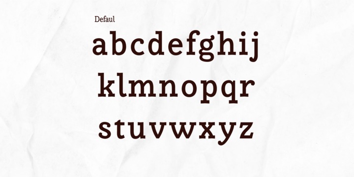
Right at the beginning Alumina would be a Clarendon with italics, when I believed I was the first to make this combination. However, the discovery that great work had already been done in this direction led me (after a lot of mess and experimentation) to find a new path with much more freedom. References of letters painted on advertisements, letters painted on boats and my own type designer repertoire were mixed. Making a family that expresses enormous strength and authority in its heavy weights; refinement and elegance in its light weights and an almost electric vitality and brilliance in any of its 36 designs.
alumina, a white, refined powder, which looks like sugar. Obtained by refining bauxite, the main ore for aluminum production. It is not as crude as its “mother ore”, nor does it have all the metallic and fine characteristics of aluminum. To achieve this, you still need a large amount of energy to be spent. And it took a lot of energy to make the large Alumina typeface family have attributes such as flexibility, malleability and conductivity, very physical attributes for a font, but with the wise use of its wide OpenType resources they will show up easily.
Well ... in Portuguese Alumina also remembers the verb alumiar and Clarendon (at least in writing) remembers to clarear, which means the same thing: to leave illuminated. However, it was the context of economic that made me sure to adopt this name, since the bad exploitation of aluminum ore has been causing a lot of environmental damage in my state and helping with a poor income distribution. Making much of it look like an anachronistic type of western. So, immersed in this scenario, I wanted to create a source that can transmit messages at the right temperature in the fight against the problems of the Amazon.
Technically Alumina is closer to a Rockwell with low contrast and its own robustness. Able to withstand rough treatments (low quality laser printing, for example) and built well enough to thrive under better printing conditions. It comes equipped with a complete set of numerals, its standard numbers are slightly less than the uppercase height. Your italic companion fits effortlessly at your side and multiplies your possibilities. The whole set comes with a set of small caps included. In addition to a careful adjustment of the kerning, the font also has: standard ligatures, fractions, alternative styles, ordinals, case-sensitive Forms, localized forms, contextual alternates and a fun set of discretionary Ligatures formed mainly of uppercase joints that are also mirrored in their small caps.
 |
| Download Alumina Font Family From Rafaeiro Typeiro |

